
When making decisions during a design process of a digital product, we can use the help of usability heuristics to guide us on the right path for more ergonomic interfaces. These list of rules can be helpful for beginners and experienced professionals alike.
More about how this list came to be and to download a printer-compatible version of this at the end of the article.
Usability heuristics
Gestalt rules
We can communicate data hierarchy with visual cues. Gestalt rules give us a toolkit to make this straightforward.
Grouping with proximity
When creating interfaces, there should be more spacing between elements that are in different sections than inside the sections.
Why?
The “Law of Proximity” states that spacing plays an important role in finding items that belong together: even small margin differences can be used to communicate information hierarchy.
Grouping with similarity

Similarly working components should look similar, elements that work differently should look different.
Why?
Similar objects are perceived to belong together. This can be used to communicate hierarchy or usage patterns. This is explained by the Gestalt rule “Law of Similarity”.
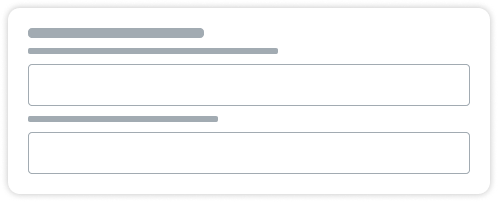
Grouping with areas

When grouping objects, placing them within an enclosed space or dividing groups with a solid line communicates belonging to the same group.
Why?
Placing objects in the same outlined section is an easy way to communicate groups. This is much stronger than just using spacing, as explained by the Gestalt rule “Law of Common Region”.
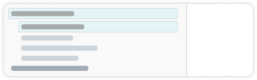
Grouping with alignment

Try to keep similar elements on the same axis, thus showing information hierarchy without the need of reading through all information.
Why?
When some parts of a pattern is obstructed or missing, the visual system fills in the gaps, as proven by “Law of Closure”. This is weaker than proximity or common area, but can be used to communicate the hierarchy of an entire system.
Color contrast
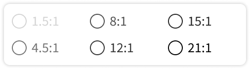
For comfortable usage, contrast ratio between foreground and background should be at least 4.5:1. When in doubt, squint and check if you can read it.
Why?
If the contrast is too low, sustained reading can cause eye fatigue and headaches, or in the worst cases, the content cannot be read at all. Contrast ratios are not easy to calculate; searching for “WCAG contrast checker” gives you plethora of results that do it for you.
Limiting options
When more than 7 items need to be displayed, use categorization. These categories should hold a maximum of 7 items each.
Why?
A healthy human working memory usually can only hold 7±2 items. When encountering more than 7 items, chances are you are going to forget the first items when you get to the last.
Minimising noise
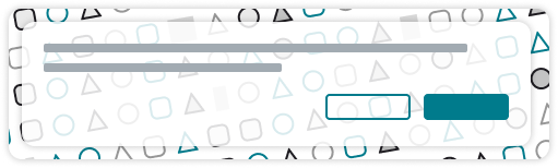
Keep strong colors and movements to a minimum, especially if used for decoration.
Why?
Any information that does not get processed becomes noise, which slows understanding and usage. Any movement, needlessly quick animation or an excessive use of primary colors may be counterproductive.
Visibility of system status

A state of the system should be understandable when looking at an interface, either after an action is taken or while recovering from an interruption.
Why?
When designing interfaces, we should always expect interruptions: when was the last time you went to get a coffee or got a phone call while using a complicated software? If you can tell where you left off, you don’t need to spend time understanding or backtracking your steps when you return.
Discoverability

When looking at a screen, you should be able to tell what actions are possible, and what outcome those will result in, even without actually taking the actions.
Why?
To flatten the learning curve, the system should communicate the possible options on every interface, and hint what they will result in, either via text (like button titles or descriptions) or conventions (such as having a close icon in the top right)
Error prevention
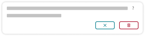
Preventing errors are better than handling them. You can prevent most errors if
- People can undo their mistakes or get notified if they will not be able to
- You provide format requirements as soon as possible
Why?
Undo is an important emergency exit you can turn to when you get to a state you did not expect, which helps experimentation. Knowing the needed format beforehand minimizes frustration and possible data loss.
Consistency

If there is a straightforward metaphor taken from the real world when using an element, don’t go against it.
Why?
Grounding elements in the real world makes it possible to build on our existing knowledge when learning a new system. Toggle switches should work like a light switch, where a change occurs immediately, while checkboxes always need saving before any state changes.
Error handling

When errors happen, explain what’s wrong in the users’ language and offer solutions if you can.
Why?
Encountering errors is inherently stressful. We can minimize that stress if we share the right amount of information that helps recovery. When deciding on the content (both the amount and the language) of the error messages, consider the background knowledge of the one who is going to read it.
Feedback

When something changes, the interfaces should mirror it as soon as possible. If the system loads slower than 1/20th of a second, use loading indicators
Why?
Two events are perceived the same if there are less than 50ms time difference between them. If that is not possible, moving indicators are a good way of bridging the time gap between them, thus hiding the latency of the system.
Recognition rather than recall
You shouldn’t have to remember information between steps. If this is the case, display the information again.

Why?
We are inherently bad at remembering information. If a system forces us to do so, we will either make more mistakes (which is undesired) or write it down somewhere (which is often a security risk). If we only need to recognize information instead of recalling it, usage is much quicker and less error-prone.
Additional context
Why do we use heuristics?
When designing for the human mind, we need information about its inner workings and mechanisms. However, as any cognitive scientist or neurologist can tell us, this is tremendously complicated and most of it is still unknown; furthermore, the methods to observe the brain during the completion of tasks (such as fMRI and Microelectrode Arrays) are only available for us for the last few decades.
This is where heuristics come into play: these are rules we established through trial and error and work quite well most of the time. We need to be mindful however: because of the nature of these experience-based guides, they are by no means universal and should not override research results or more context-specific findings.
Why these heuristics?
The User Experience Design profession usually uses the 10 Usability Heuristics by Jakob Nielsen as a basis for designing and evaluating interfaces. While created initially in 1989 and finalised in 1994 by Nielsen, they still hold up fairly well and the list is therefore a valuable resource for Experience Design processes. Our list of heuristics is based on the list by Nielsen, but modified slightly.
Why are we not listing the original heuristics if they are universally accepted and used by the community? Nielsen’s list, while the first and the most understood, was compiled well before most of our current interaction patterns reached the form we are used to: there were only a few voice-controlled (now called conversational) interfaces, and these definitely were not available to the public, and the omnipresent nature of the Internet and touchscreen devices were still a few years away.
These new types of interactions with technology changed the way we design interfaces for these devices, and this urged us to modify Nielsen’s list slightly to better match current practices and priorities.
For example, while both still relevant, the heuristics called “Flexibility and Efficiency of Use” and “Help and Documentation” did get less important in today’s fast-paced software market, but aspects like color contrast and immediate feedback, while both were included in other heuristics by Nielsen, became more relevant since the rise of portable touch screen interfaces.
Gestalt rules are also not often regarded as a usability heuristic, but understanding and using them gives a powerful tool in the hands of newcomers to the cognitive engineering field. The items on this list are also simplified both in text and illustrations to give a more easy-to-use toolkit.