
Introduction
During the process of designing, developing and testing digital products, the importance of believable data on wireframes and prototypes is often overlooked. This is mostly due to time constraints and lack of communication within the product team. It takes significantly less effort to use a simpler example text (such as the well-known “Lorem Ipsum” among others) to fill out the spaces and layouts where dynamic content will be placed.
There are some downsides to this approach however. This article wishes to outline the problem and possible solutions the product team can use to avoid pitfalls associated with using low-quality example data.
What is Lorem Ipsum?
Most people working with print or software development most likely used, or at least encountered the famous “Lorem Ipsum” placeholder. This is a text made up of latin words, which is nonsensical but still useful for filling out empty spaces where content will be displayed.

Source: Wikipedia
Why don’t graphic designers and publishers use random strings instead, since the text does not carry any meaning anyway? The reason is the following: the Latin language has a similar distribution of wovels and consonants, as well as word and sentence lengths to an English text.
Since in the Latin alphabet has a significant variance of letter widths and heights, the shape and visual weight of a word, sentence or paragraph would not match expectations if the text only contained a random assortment of characters.
Using this approach has undoubtable benefits for a graphic design project: when the content and the layout of the design is done by different people, the team members can work parallel and don’t have to wait for each other early on. For digital products, these benefits are not as trivial.
Issues with using lorem ipsum
The content is an important (if not the most important) part of a digital product. For the development team, the content is usually an afterthought, and the most important concern is understanding and setting up the validation criteria. This makes sense from a process standpoint: for customer-provided dynamic content, the variability is endless; what we can do is try to get the right constraints in place to try to avoid significant problems (such as the content being too long), but the main responsibility of the team is to create a robust solution for manipulating said data, in other words, develop the features of the application in the highest possible quality.
For the design team however, more care needs to be taken to get a sense how the dynamic content will look like. For several reasons, the design team should take time to understand what kind of content will be provided and acquire or create such data to use on design artifacts.
Layout
The primary issue with using nonsensical example data is the layout concerns. For traditional graphic design (such as typesetting a book or pamphlet), the main focus is on text and images; as long as I have an approximate idea of how long the text will take and what paragraphs need images and illustrations, I can create almost the entire book without needing the final content.
For digital products however, the most important part is interactions. This means that we have complicated concepts to explain in a short timeframe, so we are using much shorter content. This not only means that we are using shorter paragraphs on average, but an entirely new content type appears called microcopy. Microcopy, as the name suggests, is the shortest (and probably most important) part of copywriting. It consists of all content that are only a few words long, such as headers, the text on buttons and field labels. Writing these correctly is an important part of the design process and usually takes joint effort by the design and the business team.
An even more significant concern can be short dynamic content. Imagine a large amount and high density of important data in a table. How will the design team decide how to arrange the table columns have if they have no information on what will be displayed?
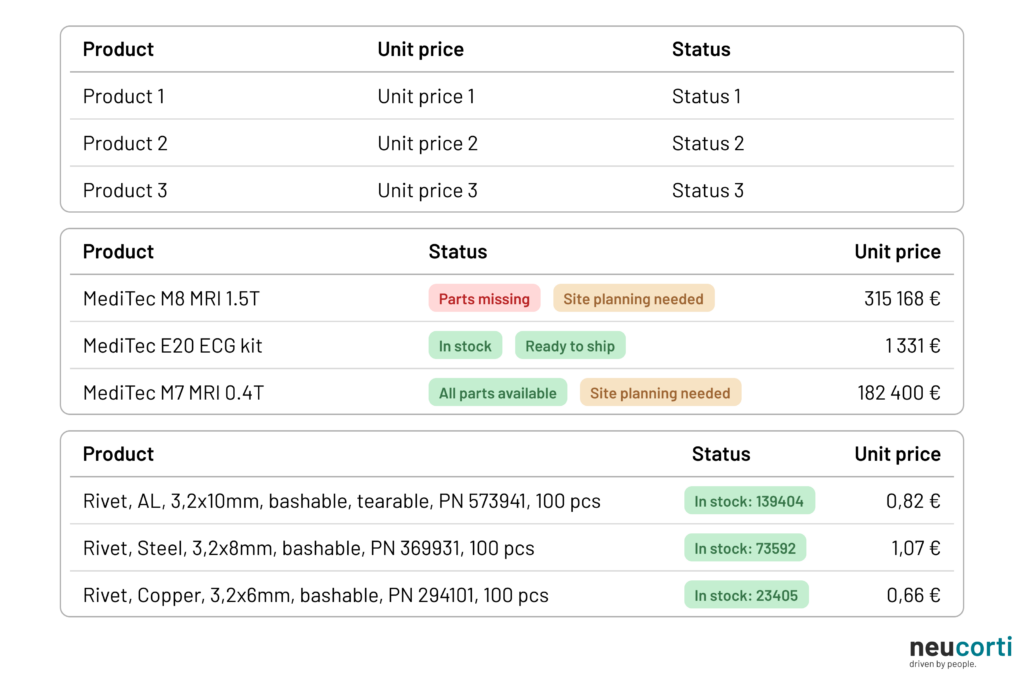
When dealing content that is only a few words long, every character matters, and this significantly influences layout decisions. This can range from changing widths of columns in a table or placing a new field in a new line to changing a complex navigation concept because the names of the actions don’t fit.
Directing focus on the wrong thing
Designing digital products is not a solitary activity: it needs constant communication with business decision makers, team members and most of all, the people the product is made for. Reaching people in these different roles and backgrounds have different methods and processes. Decision makers and team members can be easily consulted through review meetings and demonstrations using even early sketches and concepts, but end customers (the people who will use the product), who are usually not taking an integral part of the product development lifecycle, need to be reached with more traditional research methods such as interviews and usability tests.
Most of these facilitated sessions involve some amount of demonstration of already existing design concepts. What data appears on these materials however might greatly help or hinder effective communication.
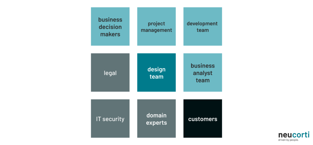
The most straightforward are usually the internal review sessions. In this case, most of the participants have an understanding on constraints and business concept behind the product, but even then, a Business Analyst, a Product Owner or an Architect might not have all the information about specific parts of the interfaces. Even within the design team (especially with large products with designers working on different parts), some explanation might be needed on what to expect on a given interface. In this case, communication can be made easier if valid data is displayed, since it needs less verbal explanation and understanding and reviewing can even be done beforehand.
Reviewing with business stakeholders, domain experts and other support roles (such as IT security and legal) takes a bit more effort, since these people usually have a different type of understanding and perspective on the processes involved. This often means that a simple placeholder text that was left on a presented design might direct the attention of members on something that might not be as relevant at that point in the product lifecycle, such as nomenclature or backend data handling. These sidetracks can be eliminated (or at least minimized) if the concepts shown are at least believable at first sight.
Affecting research results
The most complex of review events are the usability tests: in these sessions, a prototype is shown to the end customers (someone from the product’s target group) and a short list of tasks has to be completed on said prototype, while the researcher observes and tries to understand the cognitive processes happening throughout usage. This is a powerful tool in the hands of the design team, but it takes significant effort and a specific skillset, so most design teams have members who are highly skilled in these research methods, since the approach and experience of the researcher has a tremendous impact on the results.
The quality of the prototype is also important: if it is not working well or some usage paths are not designed correctly, the team might miss important insights, but the quality of the information displayed on the prototype is also imperative. This is increasingly true with software that is not made for the general public, but business tools made to digitalize and optimize a workflow. In this case, the participants on these research sessions are often those very people who do these tasks in the current method (either manually or in a different software tool), and this brings up a different challenge for the team, since these people often know the process and know what data to expect.
After all, the whole point of a digitalization effort is to make the software tool completely transparent: if designed correctly, these tools should feel like an extension of ourselves used to manipulate the data and processes that the system controls. If the data displayed on the prototype is not correct from a business standpoint, participants with the right amount of experience in their field will notice it, and might wonder why that is: will bringing in the new system change the process significantly, or is the data displayed in a format I don’t understand?
Usually, the answer is neither; the product team just didn’t have the resources or didn’t spend the effort to come up with quality examples. This both slows the understanding of the new system and often blocks the researcher in collecting the insights these sessions are conducted for.
How to get example data
Getting the right example data to use on design artifacts is not always easy. First, the team needs a high-level understanding of business processes and data constraints, which often needs technical background knowledge and tight collaboration with the rest of the team. Even then, this information might not exist within the team, which is often the case with projects working on entirely new processes and business concepts.
When this is the case, it might be beneficial to use placeholders that do not contain text (such as blocks) to design layout and get early feedback. Other than saving time, it also has the benefit of focusing the viewers attention on layout instead of specific details (the same way low fidelity “napkin” sketches do), and this might speed up the process of reviewing and iterating on layout and mental architecture.
If data is available (maybe even entire databases from an earlier project), using real life examples is often not viable: sensitive business or personal data cannot be included in less controlled artifacts, such as prototypes, marketing materials or user guides. In this case, it can still be useful for understanding the stuctures and patterns in data.
The team can try to come up with data manually, which often results in high quality examples, but can take significant time. In the case of complex domains, the additional help of domain experts is often needed (such is the case for any medical or legal area), which also adds additional cost for the design process.
The use of Artificial Intelligence agents also provide assistance in this tedious process. While early models often produced low-quality data, newer agents can create large amounts of acceptable quality example information quickly when given the right prompts. Even then a manual review might be beneficial, especially when used for usability testing or public materials. The same AI systems can be used to speed up several steps of the product lifecycle, but should be used with caution to avoid negative impact on the end product.
Summary
Deciding what will be displayed on a design artifact as an example might feel irrelevant and is often just an afterthought during the design process. But using the right data can speed up collaboration, result in better design decisions and in some cases can be crucial to be able to create a usable product at the end of the product lifecycle.
Product teams should take extra measures to ensure the quality of the design artifacts by consistently using believable data by either creating them manually or with the help of generative tools. When done correctly, this initial effort can save countless hours and result in better research results when validating design concepts.